Dichung
Dec 10, 2023
Dichung is a Vietnamese tech startup dedicated to helping individuals optimize their vehicle spaces and contribute to environmental conservation.
As pioneers in Vietnam, Dichung received the Low Carbon Award from UNDP and are supported by the World Bank for their innovative climate change initiatives. Although still a developing company, Dichung is committed to progress.
At Dichung, my responsibilities cover a broad range of tasks related to design, including comprehensive design activities, as well as a specific focus on enhancing the user flow for a more streamlined and user-friendly experience.
(Small disclaimer: Our team use Vietnamese in some of our work, and, of course :D throughout the entire website)
Concept & Development
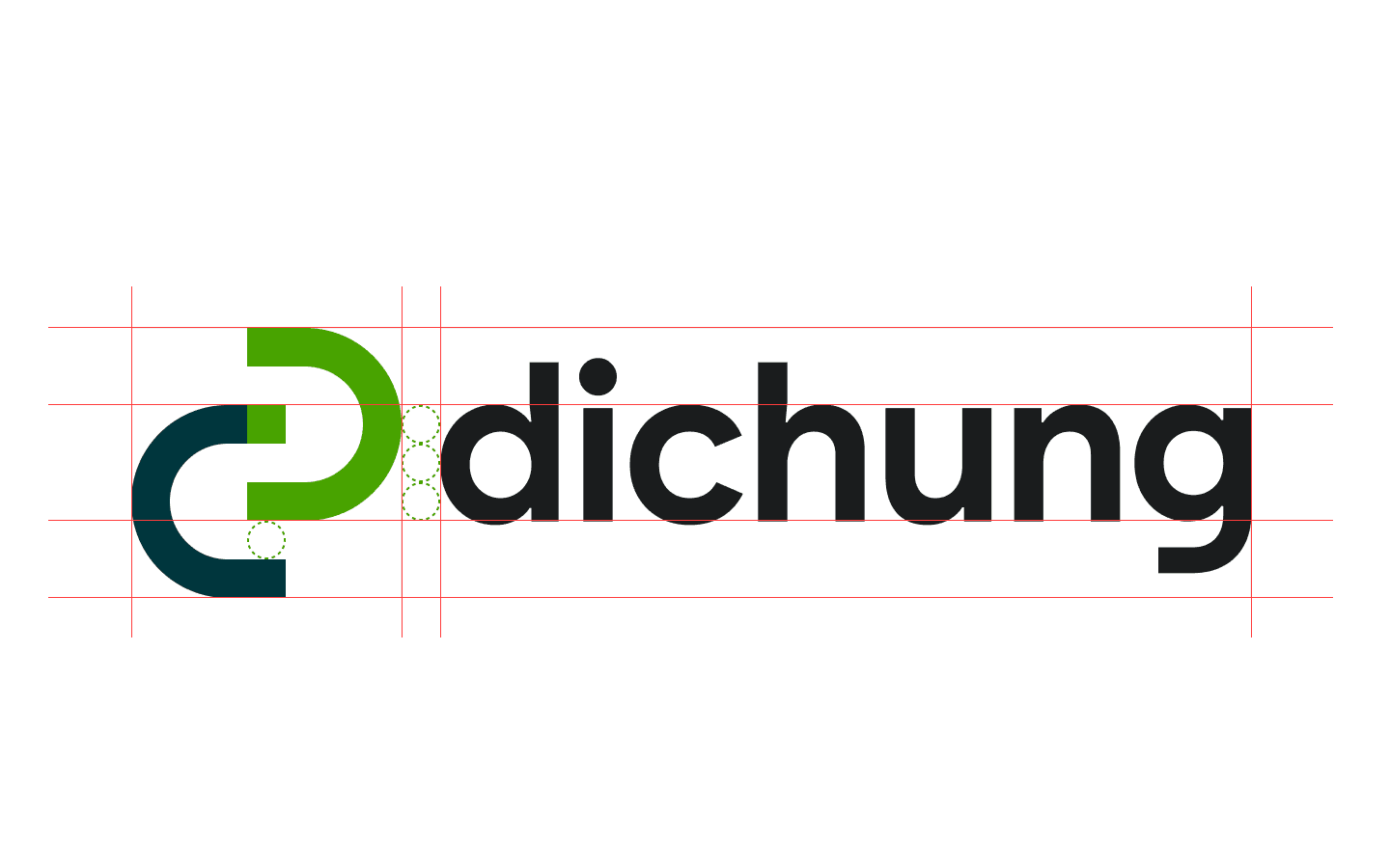
The logo of Dichung is created with a focus on a "perfect curve," forming from the letters D and C. The right part of the curve is intentionally colored to match the left part, making the letter "Đ" stand out clearly. This design ensures that the brand representation looks smooth and balanced.
Dichung has chosen two main colors: Green and Dark Blue. Green brings in a sense of freshness, growth, and caring for the environment, reflecting Dichung's dedication to sustainability. On the other hand, Dark Blue adds a touch of professionalism and trust, making users feel secure and confident in using Dichung's services.
By carefully selecting and combining these colors in the logo, Dichung not only creates a visually pleasing brand image but also communicates important values. The vibrant Green shows the company's commitment to a fresh and eco-friendly approach, while the reliable Dark Blue reinforces trust in the brand. Paying attention to these design details ensures that Dichung's brand not only looks good but also conveys the right messages and values.
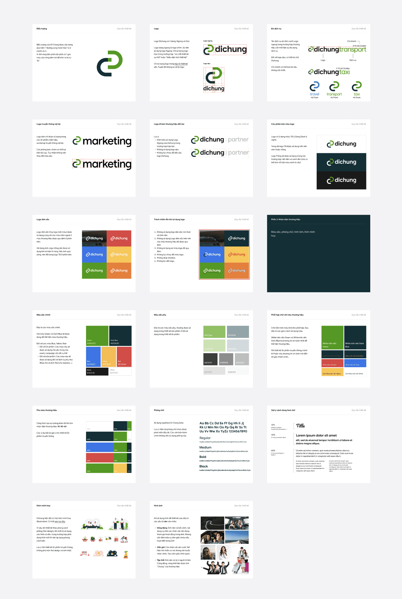
Brand & Logotype
When it comes to using our logo and brand, we've set some guidelines after discussing and agreeing with our shareholders.
For example, if we're offering different services, the service name will be placed next to the logo for a horizontal display to show the variety of services we provide. For the vertical logo, we might leave out the word "Dichung."
We have a Dark logo for gray or white backgrounds and a White logo for dark backgrounds like black or navy. If we're dealing with a single-color logo, we use it with colors that are not part of our main brand colors.
For backgrounds in Blue, Yellow, and Red, these colors are mainly used in events and campaigns. Each color is assigned to specific services, like Blue for travel and Red for express services.
When using images in our designs, go for lively visuals with clear contexts and content. Keep things simple in terms of colors and patterns. Show characters that are happy and friendly, and try to avoid sad or tearful expressions. Group photos with two or more people are encouraged to highlight the collective nature of our brand.
We also have some rules about when not to use the logo:
Avoid using faint monochromatic logos on background images
Don't use monochromatic logos on specific brand colors, stick to the correct logo color, and don't make any unauthorized changes or add drop shadows.
App Icons
Dichung's adaptable logo extends to various app icons, each tailored for specific services or platforms. This nuanced approach enhances user engagement and reflects Dichung's commitment to a cohesive and user-friendly brand experience.

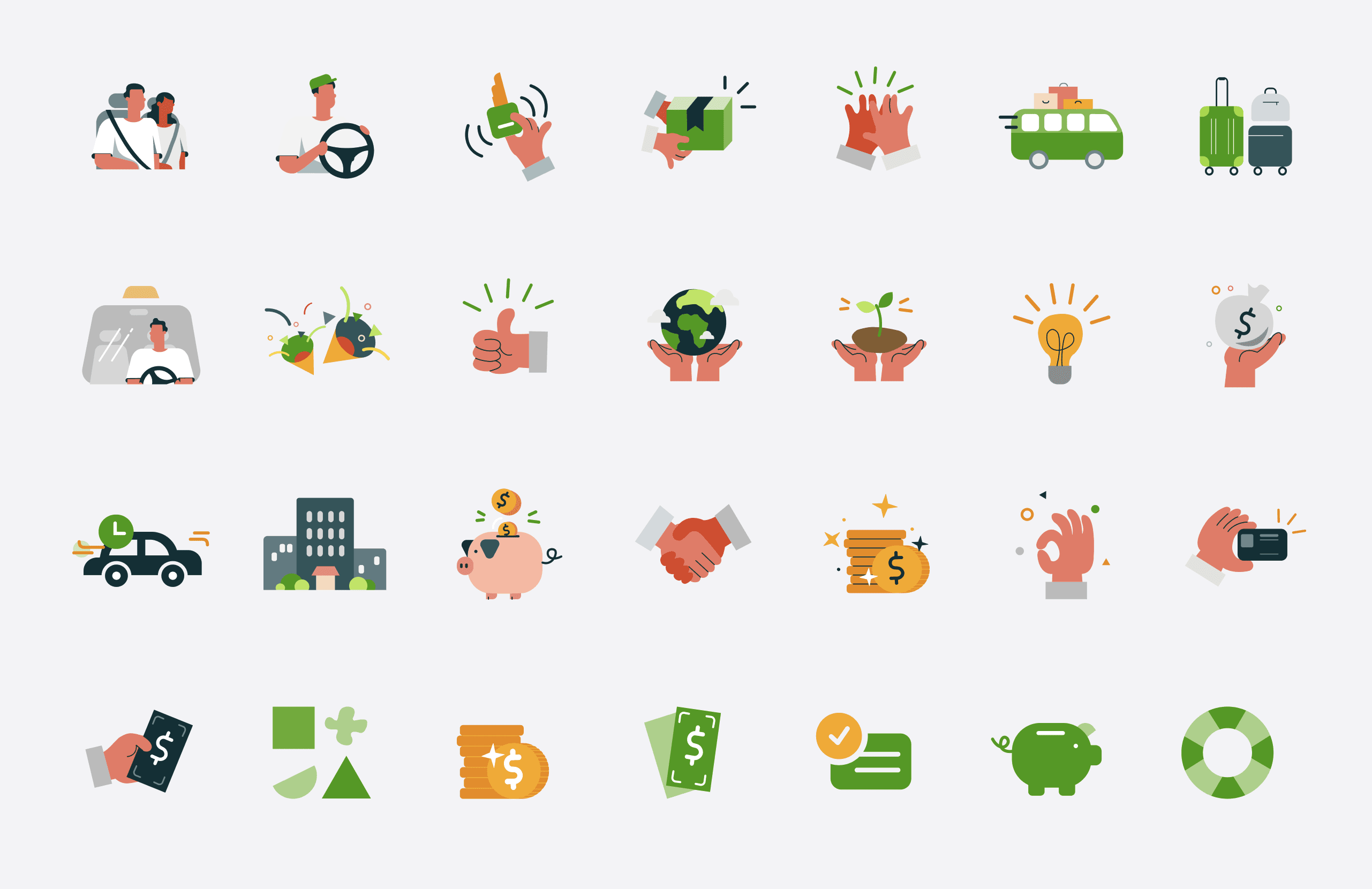
Illustrations
Dichung's illustrations are specially made for their transportation service, showing a lively and user-friendly style. The illustrations match the company's promise of efficient and eco-friendly transportation, making you feel like things are moving smoothly and reliably.
User Interface
Design System
When I started working at Dichung for the first time, I was instructed to use our design system, which the team had built from scratch. Our design system is neatly organized, like different layers of sheets, each covering different ideas:
Level 1: The big picture, called "Process/Todo," which gives an overview of the workflow.
Level 2: This is all about the fundamental elements that shape the Dichung experience, affecting how everything looks and works on the user interface.
Level 3: These are the small but important parts you see scattered throughout the app and web. They are like handy tools that make the user experience smoother and more consistent.
Due to our team's modest size, the ongoing development of the design system remains an active and collaborative endeavor for the team as we move forward.
Process/Todo

Fundamental to the dichung experience - Affects all UI surfaces

Small part used through the app/web - Utility UI elements across experience

The User Interface
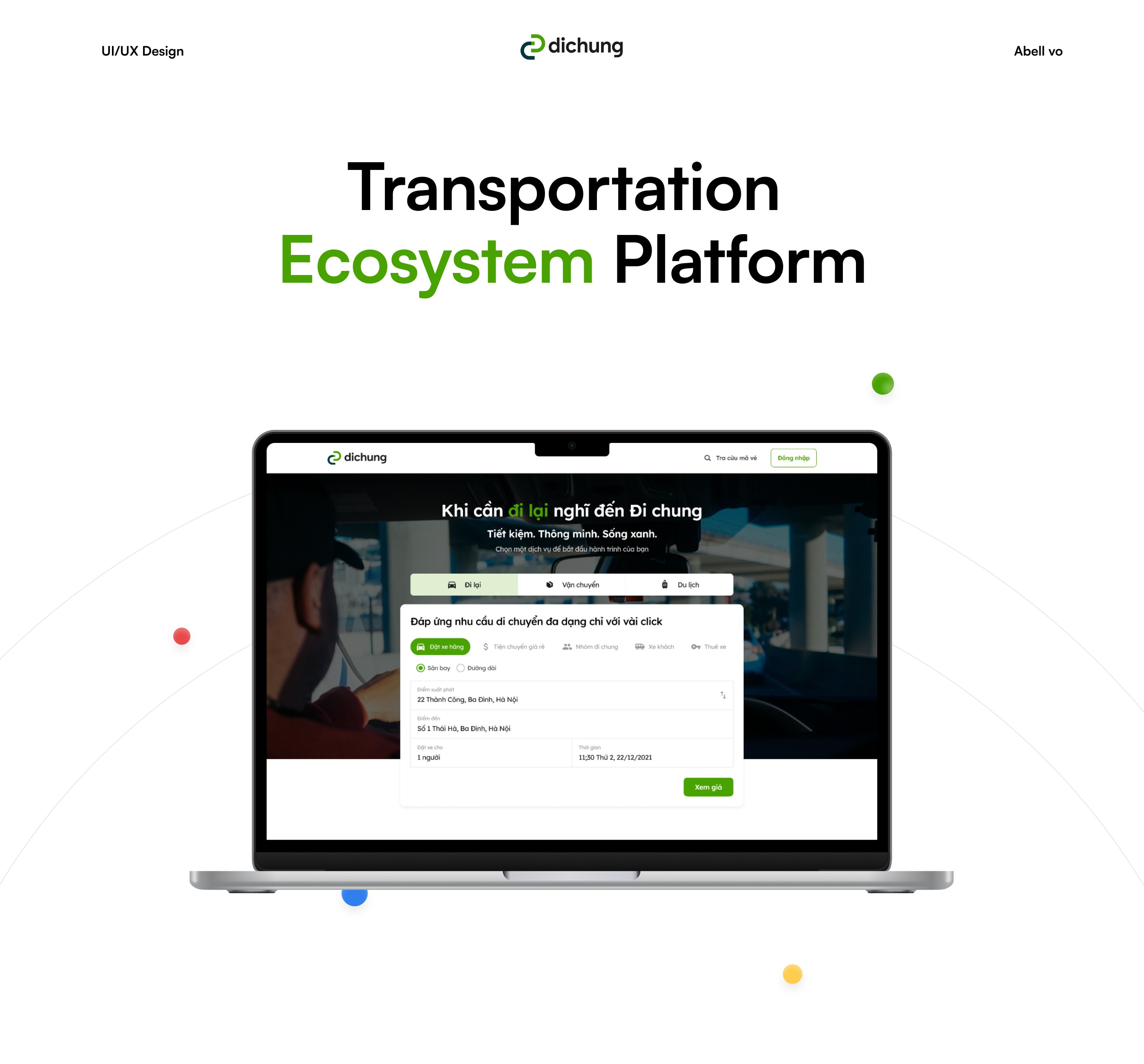
In my chat with the founder @Nam Nguyen back in 2021, he shared some worries about the website's performance. One big problem was that users couldn't easily book services when they first visited the site. The old website was confusing, and it took too many clicks to make a booking, leading to fewer people using the site and making bookings.
Nam wanted to change how customers interacted with the website to make things smoother and more user-friendly. This realization sparked a plan to redesign the website entirely.
The main goal was not just to fix existing issues but also to make the website match Nam's vision of a hassle-free booking process. This redesign aimed to address Nam's concerns and create a better online experience for users, ultimately boosting engagement and bookings for the business.

Design Process
The Challenge
After reviewing the previous design and taking into account the low levels of user interaction and booking rates on the website, as well as insights gathered from persona research and collaborative discussions with both the team and the founder, a critical issue came to light. The website, unfortunately, fell short in encouraging users to initiate bookings.
This deficiency became even more apparent as the overall flow of the site felt confusing, particularly considering the concurrent development of other businesses within the ecosystem. Confronted with this challenge, our focus extended beyond encouraging bookings to addressing a pivotal concern: ensuring users did not perceive the service page as neglected or encountering errors. Solving this problem was essential to maintaining user trust.
In addition, we encountered a more bigger challenge: How to not only motivate users to make bookings but also streamline the process by minimizing unnecessary clicks, thereby fostering a quicker and more efficient booking experience.
This multifaceted challenge required a thoughtful and strategic approach to design, prompting us to explore innovative solutions that would not only boost user engagement but also enhance the overall usability of the platform.
The Proposal
After engaging in extensive conversations with the team, we collectively decided to embark on the implementation of A/B testing techniques.
This strategic approach was chosen with the intent to thoroughly validate and pinpoint the most suitable design for our platform. Our goal extended beyond mere alignment with business objectives; we aspired to tailor the design to provide users with the most seamless and intuitive booking experience.
The adoption of A/B testing signifies our unwavering commitment to making informed design decisions based on evidence. This methodology ensures that the selected design not only effectively meets the business goals but is also finely tuned to resonate with user preferences.
By subjecting different design variations to rigorous testing, we sought to gather valuable insights that would guide us towards crafting a user-centric interface that not only serves the needs of our business but also enhances the overall experience for our users.
This iterative and evidence-driven approach underscores our dedication to continuously refining and optimizing our platform to achieve the best possible outcomes for both our business and the individuals interacting with our services.

A/B Testing
After conducting extensive research and collaborative discussions, I proposed a design tailored for the implementation of A/B testing techniques.
For Version A, I made significant changes to the website's first section by removing illustrations that didn't contribute to the booking process. Instead, I introduced a compelling narrative about Dichung, incorporating keywords tailored to each service.
For instance, phrases like "Think of Dichung when you need to travel/transport/tour" were employed. Below, I showcased various services with prominent "Book Now" buttons to capture user attention.
In a departure from using generic illustrations, I opted for real images as the background. This decision aimed to make the business feel more authentic and vibrant, aligning with user personas and the transportation-focused domain of Dichung.

Real images were deemed more effective in facilitating user engagement and accessibility for the business, providing a tangible and relatable context. Given Dichung's geographical base in Hanoi, Vietnam, this shift to real images also played a significant role in transforming the visual approach, contributing to a more effective and region-specific user engagement strategy compared to generic illustrations.

For Version B, instead of using the "Book Now" action button, I introduced a modification where, for each service, a booking form is immediately available when users enter the website. This approach minimizes the need for users to click excessively to book a service with Dichung.
This strategic adjustment is anticipated to not only boost the number of bookings for Dichung but also revolutionize the user experience. Rather than navigating through multiple steps to gather information, users can now simply make a booking with just one click.
This alteration has the potential to influence user behavior positively, fostering a tendency for users to return to the website more frequently. By simplifying the booking process, the redesigned Version B aims to enhance user interaction and engagement, providing a more user-friendly interface.
In terms of aesthetics, the background color in Version B is a distinct gray, strategically chosen to accentuate the booking form and highlight Dichung's logo.
This deliberate use of color serves not only to draw attention to the booking process but also to reinforce the brand identity, creating a cohesive and visually appealing experience for users interacting with the platform.


Addressing the challenges faced, Dichung confronts the complexity arising from the ongoing development of numerous services within its business framework.
Notably, the intricacies within each service, such as:
The "Ride-Sharing" service with its five sub-services (brand-specific car booking, convenient trips, group rides, passenger buses, and rental cars).
The "Transportation" service featuring three sub-services (delivery, truck rental, and convenient trips), and The "Travel" service. Additionally, each sub-service includes further distinctions, like long-distance travel or airport transport.
Designing a user-friendly website that ensures clear and unified tiered services, minimizing confusion, presented a substantial challenge. Crafting a design solution required thoughtful consideration of Dichung's multifaceted service offerings.
After discussions with the team, Version B underwent a transformation. Instead of a predominantly gray background, I opted for realistic images tailored to each specific service Dichung provides.

This adjustment aimed to enhance realism and familiarity on the website, creating an immersive and relatable visual experience for users navigating the diverse range of services offered by Dichung.
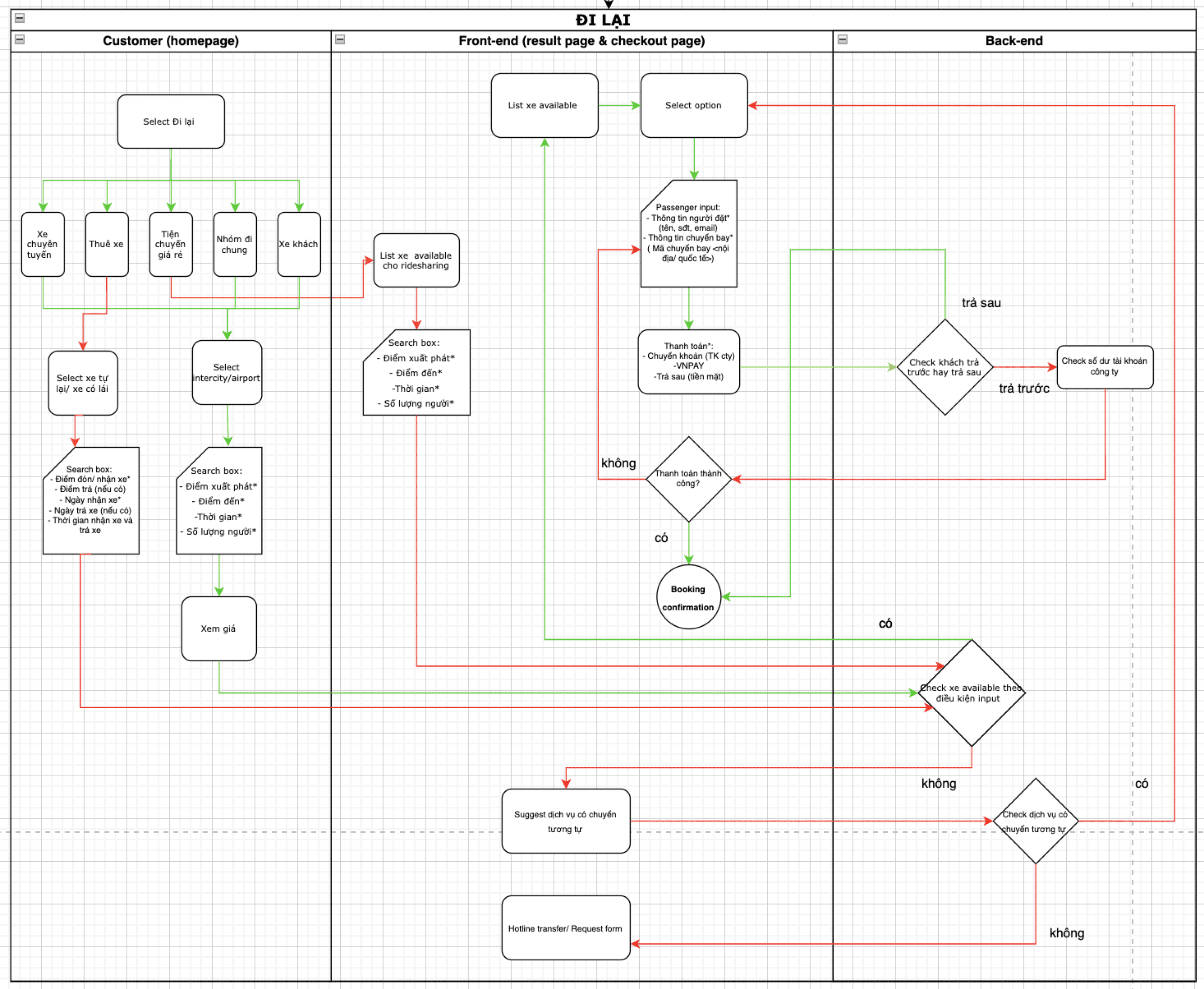
Website Flow
Following the successful outcomes of our A/B testing, we achieved the desired results from version B, witnessing a substantial growth in website interactions.
Addressing the challenge posed by services still in development, I made a strategic decision not to omit them but rather to incorporate them into the company's service portfolio.
This approach provides users with a clearer understanding of the potential and diverse services Dichung offers, while transparently indicating that these services are still in the developmental phase.
Continuing the design journey, I delved into shaping the website's flow, considering the interconnectedness of ride-sharing with various other services offered by Dichung.
Given the diverse services, Dichung has multiple web pages linking informative content to the tour share. In this process, it was crucial for me to comprehend the customer journey, from the point of booking to the payment process, in order to design additional web pages that complement and enhance this user experience.


Moreover, I extended my focus to the intricate details of post-booking processes, ensuring a seamless and user-friendly transition from booking to payment, as well as other activities on the website, such as sharing tour opinions.
This holistic design approach not only solidifies Dichung's online presence but also enhances the user journey by providing a cohesive and comprehensive web experience that extends beyond the initial booking phase.
You can view the Dichung website here and... not all of my work is fully developed on the website.
How we work at Dichung
At Dichung, my team work remotely, handling tasks and management using Notion and messaging. We have team meetings twice a week, sometimes once a week, with most of our communication and collaboration taking place on Notion.
Our team is very open and friendly, communicating a lot during meetings and reaching out via text whenever needed. Despite meeting only online :) our team is respectful, listens to each other, and maintains a positive and collaborative atmosphere.
My Learning
In my initial role as a UX/UI designer, I received thorough guidance from both my manager and the founder. Collaborating with the team, I learned not only how to present designs effectively but also how to express my own ideas.
This experience deepened my understanding of UX/UI, covering everything from methods and research techniques to experimenting with various designs to achieve the best results.
Working closely with the team provided me with valuable insights into design principles, effective communication, and the strategic application of UX/UI concepts. The mentorship from my manager and the founder played a crucial role in shaping my design approach, ensuring a holistic understanding of user experience and interface design.
I not only learned about methodologies but also the importance of testing and refining multiple design variations to reach the best final result.
Moreover, this role expanded my skills in collaboration and teamwork, helping me appreciate diverse perspectives and incorporate feedback effectively.
The learning experience wasn't just about technical skills; it also emphasized the soft skills essential for successful collaboration in the design field. This foundational experience has set the stage for my ongoing growth and development as a product designer.