Designathon 2023
Sep 23, 2023
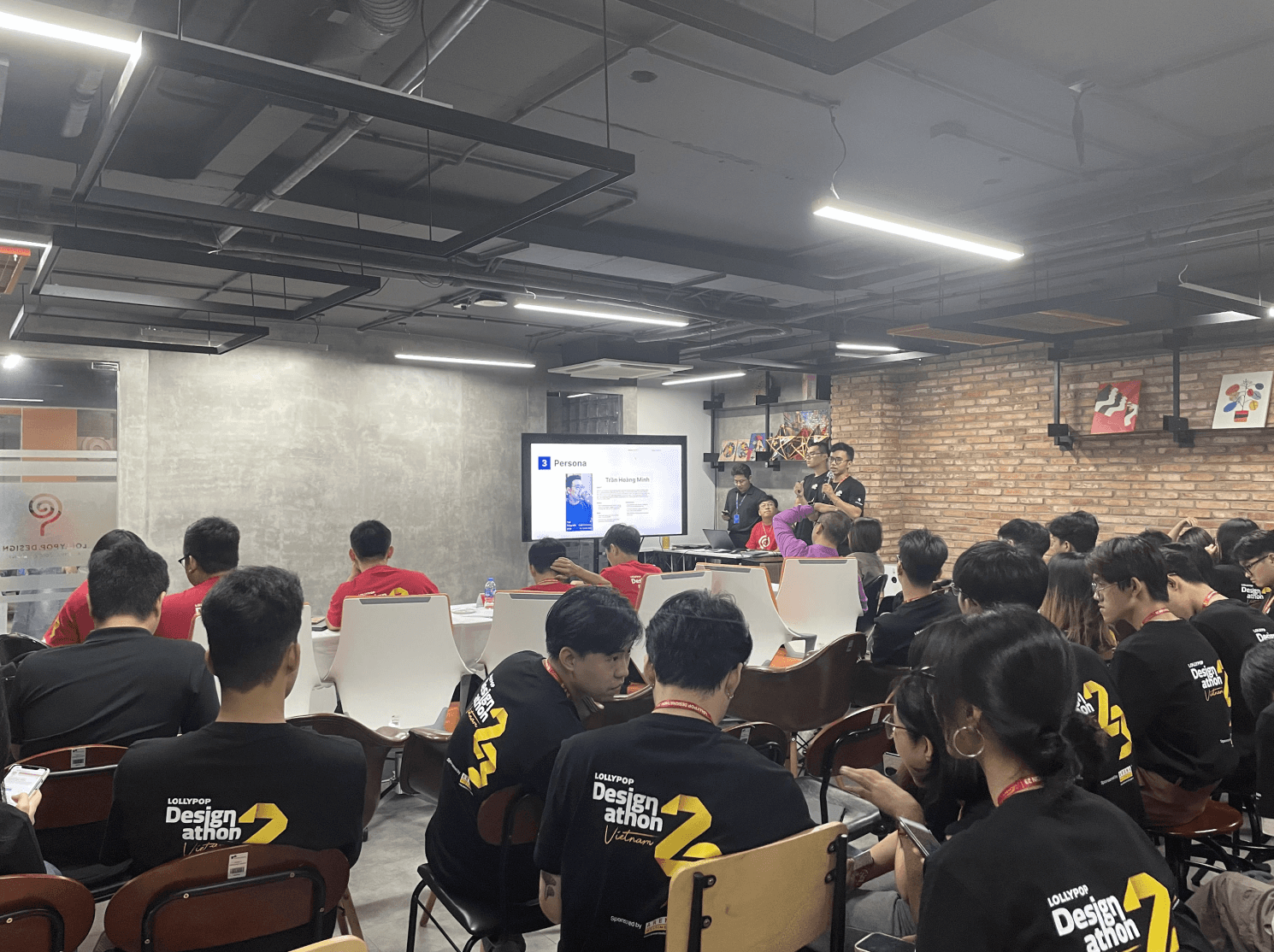
A Dynamic 12-Hour Design Hackathon - Designathon is a competition organized by Lollypop Design Studio that I participated in during my final year of college in 2023. After receiving an email about the competition and realizing it could be an opportunity to enhance and challenge my skills, I decided to take part.

Design Challenge
Problem Statement
Arena Multimedia is a design education center aspiring to be the top choice for young individuals seeking to become professional designers. The "Featured Projects" page is where they take pride, as it showcases the credibility and teaching quality of Arena Multimedia through students' output projects.
Currently, Arena Multimedia's top priority is to transform the user experience of the "Featured Projects" page into an impressive and memorable journey. Displaying projects (similar to platforms like Dribbble, Behance, and Adobe) will also make it easier for learners to connect with potential employers.
Challenge
The design solution aims to provide a more visually impressive experience and a clearer information organization structure for Arena Multimedia's "Featured Projects" page. This, in turn, will increase the registration rate of students at the institution.
Things to consider
Target Audience: Individuals seeking a reputable design education provider.
The solution should be specified in a website format.
How to spark interest in viewers regarding the projects and encourage them to learn more about the authors?
Avoid limiting creativity to the existing style on Arena Multimedia's website.
My work — Teamwork
Our team comprises five members, each a designer with diverse backgrounds spanning education, healthcare, photography, and more. We came together for a competition, having only known each other for about a week before the event when we were randomly grouped.
Upon receiving the challenge, our team convened to strategically allocate tasks based on each member's strengths. After a thorough discussion of individual strengths, we delineated everyone's responsibilities. The next step involved collectively delving into an analysis of the problem statement, refining it to accurately encapsulate the business challenge at hand.
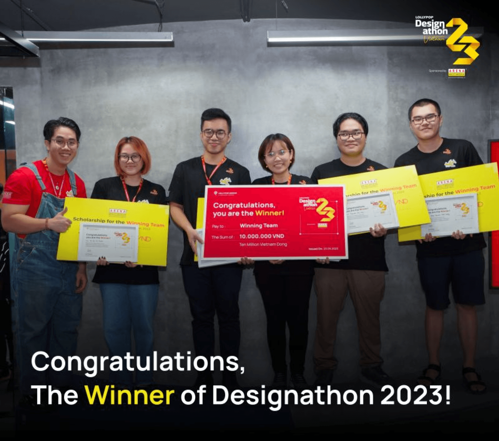
Taking on the role of team leader, my responsibility was to guide the entire team in dissecting the issue and charting a course forward. Despite being the youngest team member, I leveraged my existing experience with confidence to lead the team in solving the business challenge accurately, ultimately securing the first prize in the competition.

Our talented team member :D Quan, Huy, Khoa, Khoi and me.
Design Process
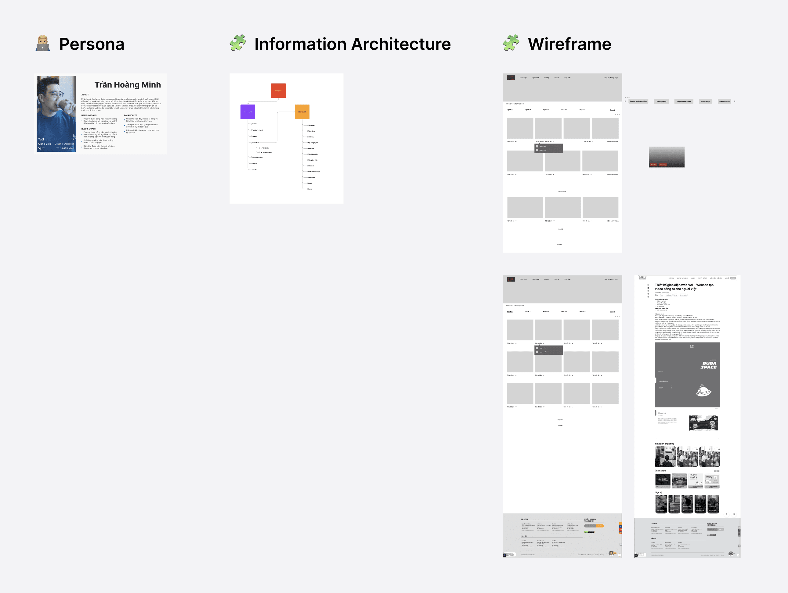
Based on the guidance provided by the competition organizers, our team tackled the business challenges by first doing thorough research. We explored details about Arena Multimedia, the industry it operates in, and its competitors. This information helped us create a detailed user profile, which was key to understanding our target audience.
We didn't stop there. To get real-world insights, we interviewed potential users, including a team member with a background matching our user profile and an HR representative. These interviews provided valuable perspectives from both learners and employers.
With all this data in hand, we analyzed the core issues the business was facing. This analysis guided us in creating a clear blueprint, or wireframe, for the redesign of Arena Multimedia's "Featured Projects" website section.
When it came time to design the user interface, I faced a time crunch. Having already spent most of our time on research, I made a quick decision to use UntitleUI components for the website redesign.
This choice saved time and allowed us to create a polished, visually appealing UI within the tight deadline. The end result was a complete and refined user interface that met all the competition requirements—a testament to our team's ability to overcome challenges effectively.

How we work
You can explore the final presentation of our team here and check out the team's post on Linkedin.
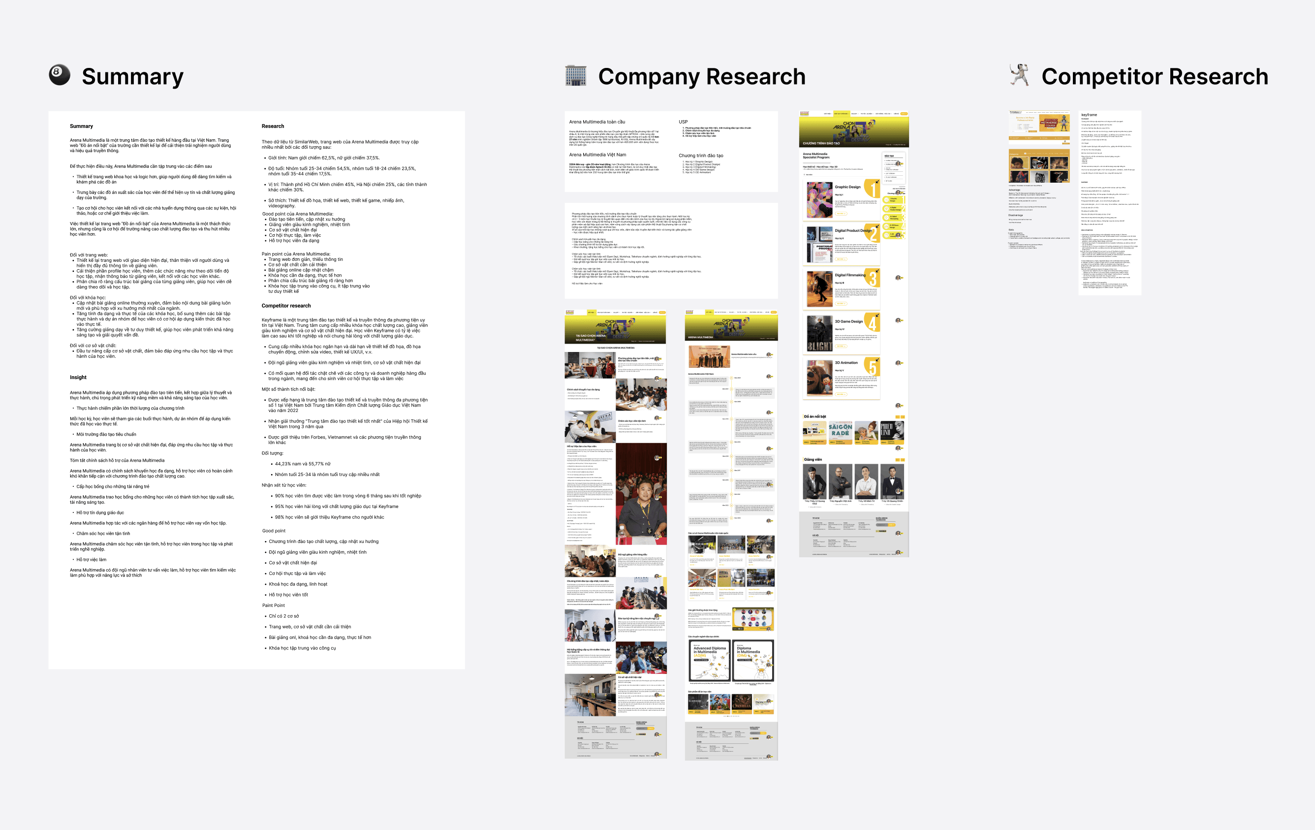
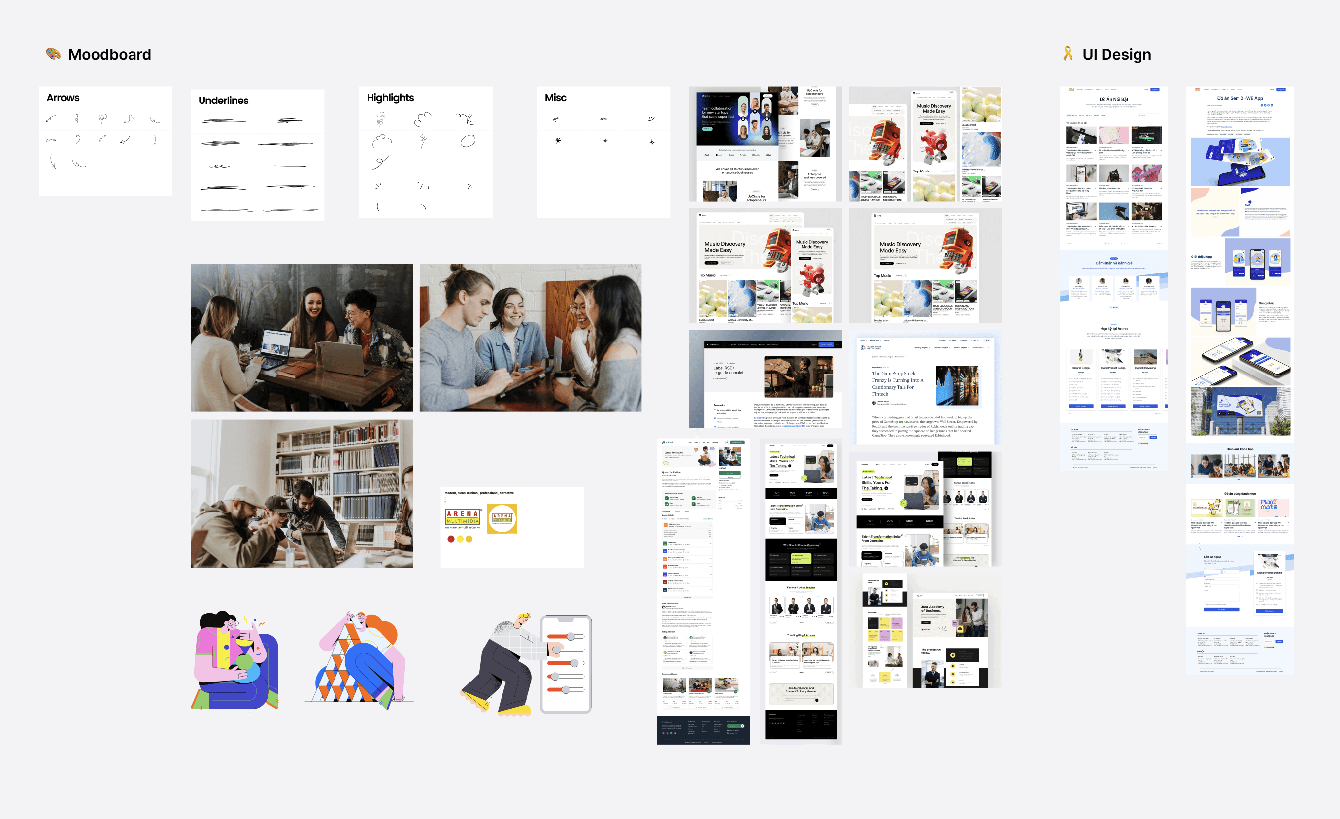
How the website compares to the final UI redesign
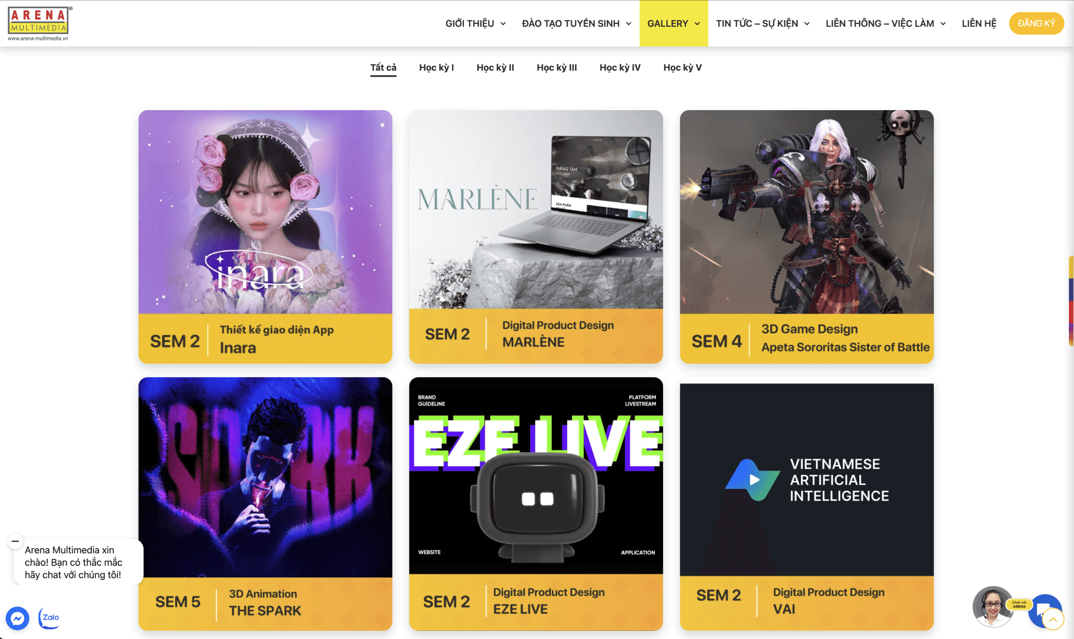

(Small disclaimer: Our team use Vietnamese in some of our work, and, of course :D throughout the entire redesign website)
It's important to note that our team had the authority to make comprehensive changes to the website, including alterations to branding elements and color schemes.
The Presentation
